
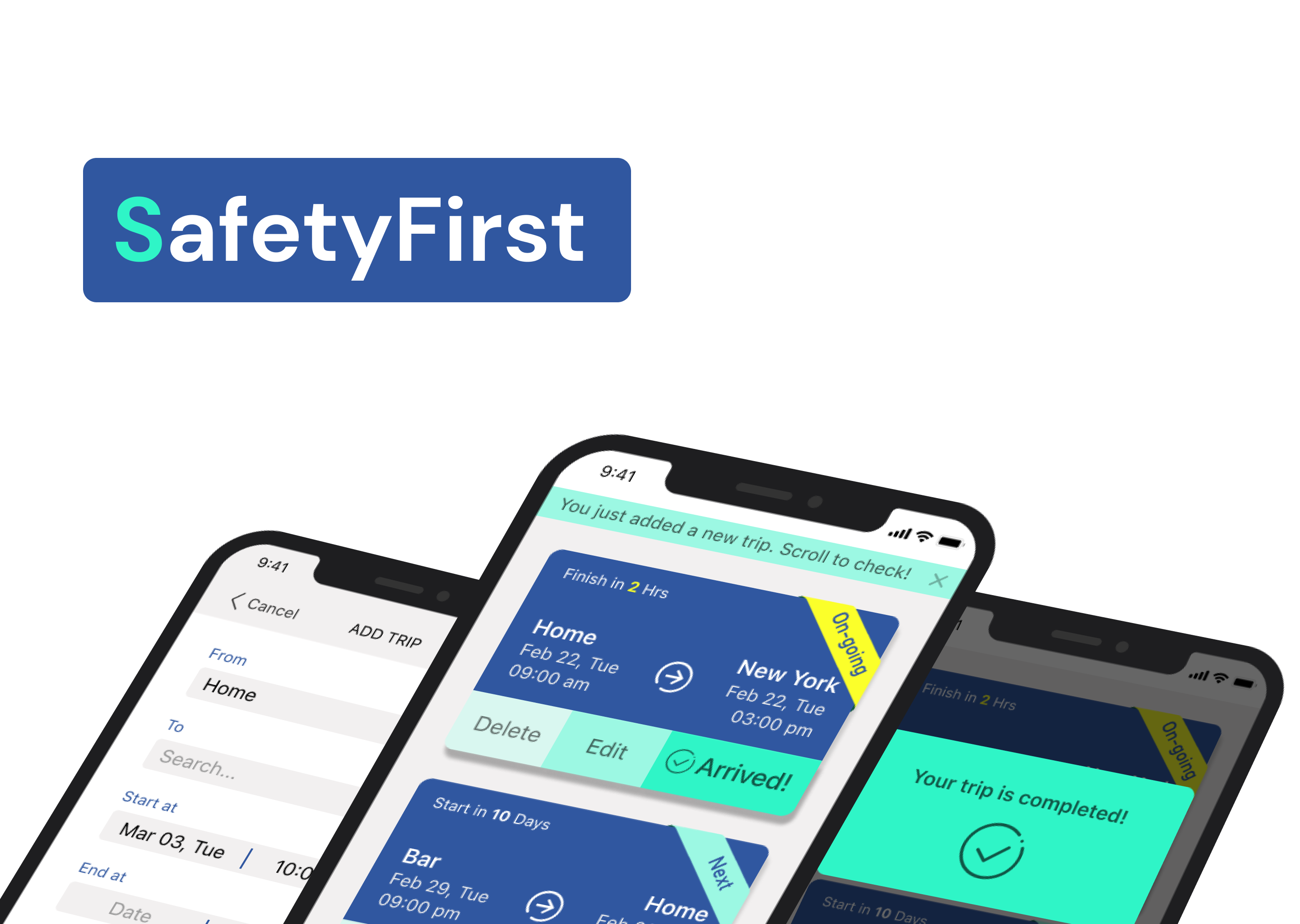
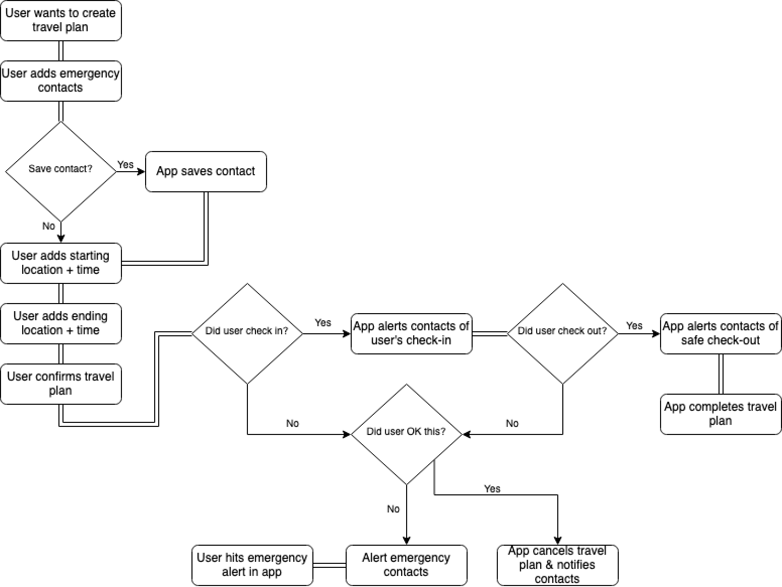
This is an safety-alert App that allows users to setup travel plans, and if they cannot confirm their plans due to emergency situations, a SOS message will be sent to pre-set persons.
I am the designer in the team. I worked with my partner, a user researcher and did all the low-fi and hi-fi prototyping. I also helped with the usability test and analyzed the result.
The safety problem of people alone, especially women, is still a huge problem. Research shows that 59% of women who ever walk down an alley alone always or often feel unsafe doing so, while 50% feel similarly about walking alone at night.
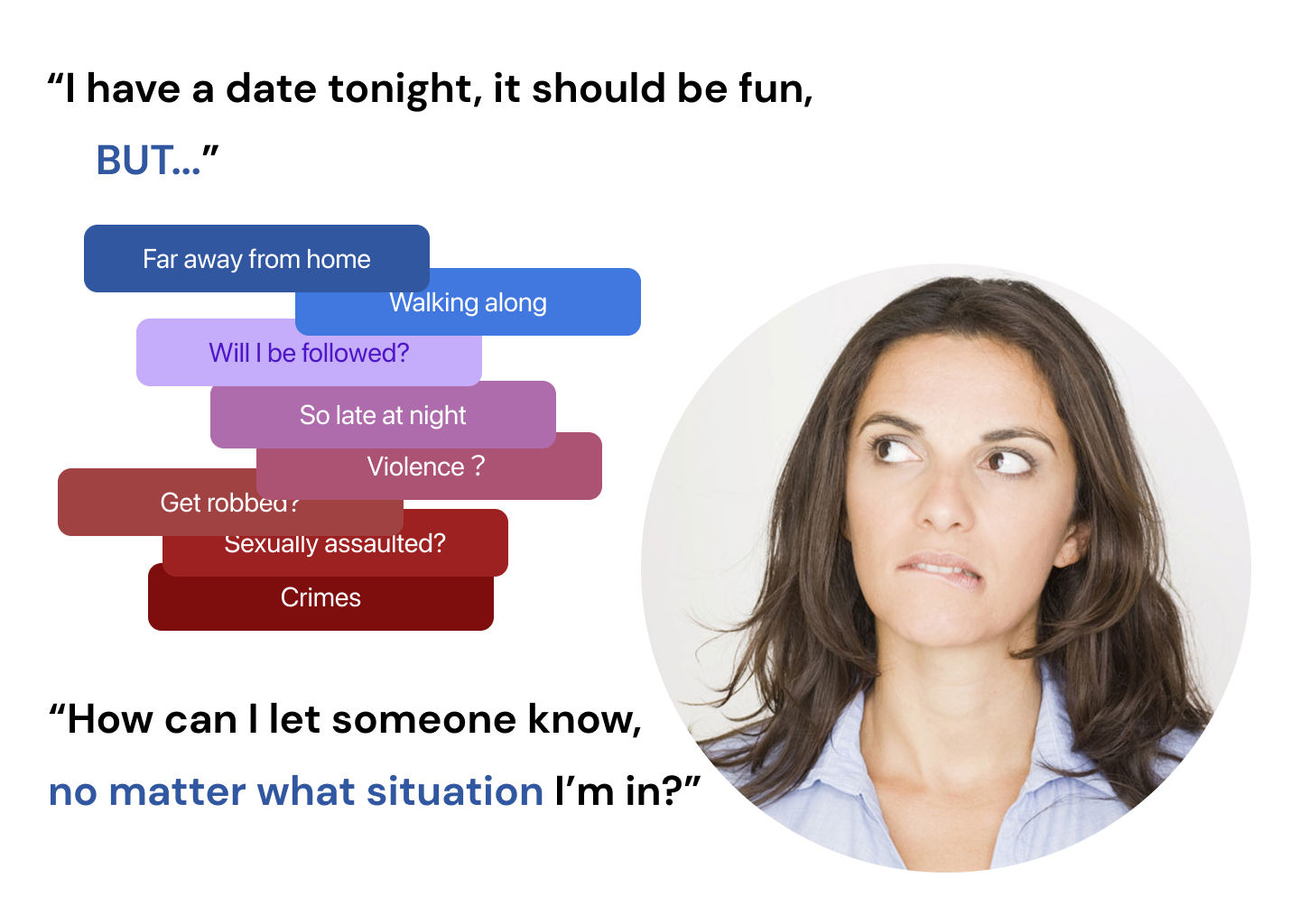
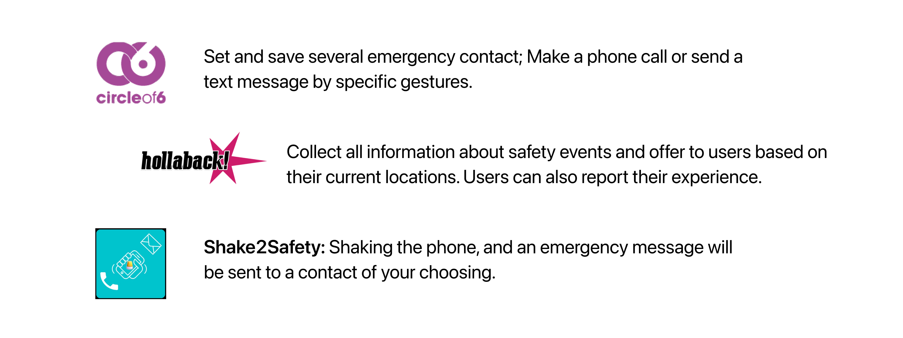
...BUT these Apps still cannot help AUTOMATICALLY
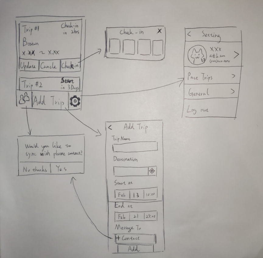
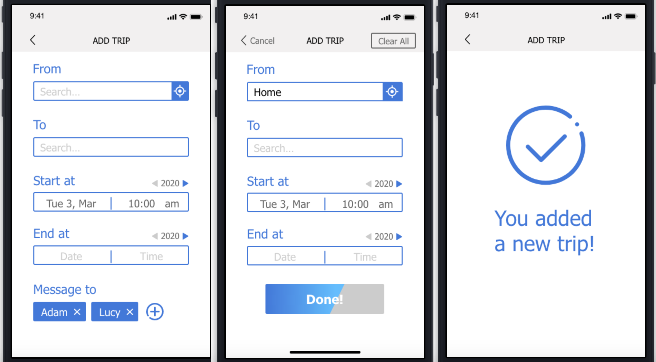
After the quick test of the flow, I created the first version of hi-fi interactive prototype.


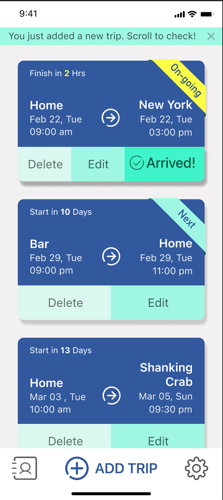
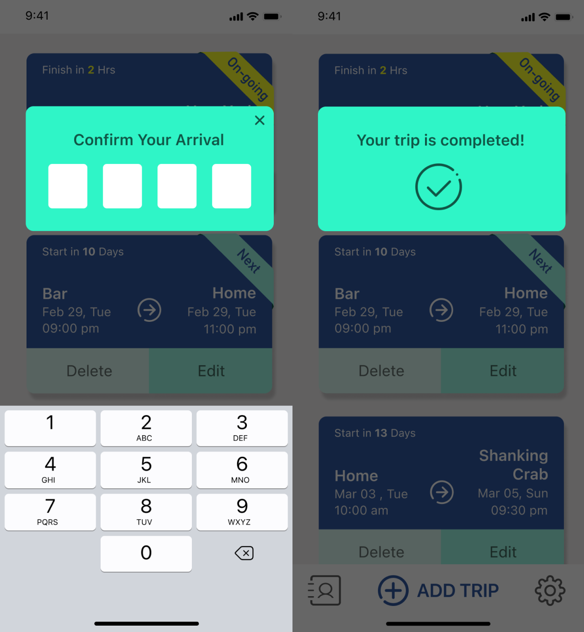
5 participants were invited to the test. The tasks of this test includes reviewing the whole App, adding a new trip and check-in the current trip. The test is aimed to see if they can figure out what this App can do and use it easily.
The result came out to be very well. All 5 participants understand the purpose of the App by reviewing it and accomplished tasks. They also gave a 4.4 out of 5 for the overall experience.
However, the test also shows some flaws in this design. The text for some features are not consistent ("edit" and "update", "cancel" and "delete"), and the word "check-in" made 2 participants confused a little bit. The submit button is also hard to find since it's not on the first page.
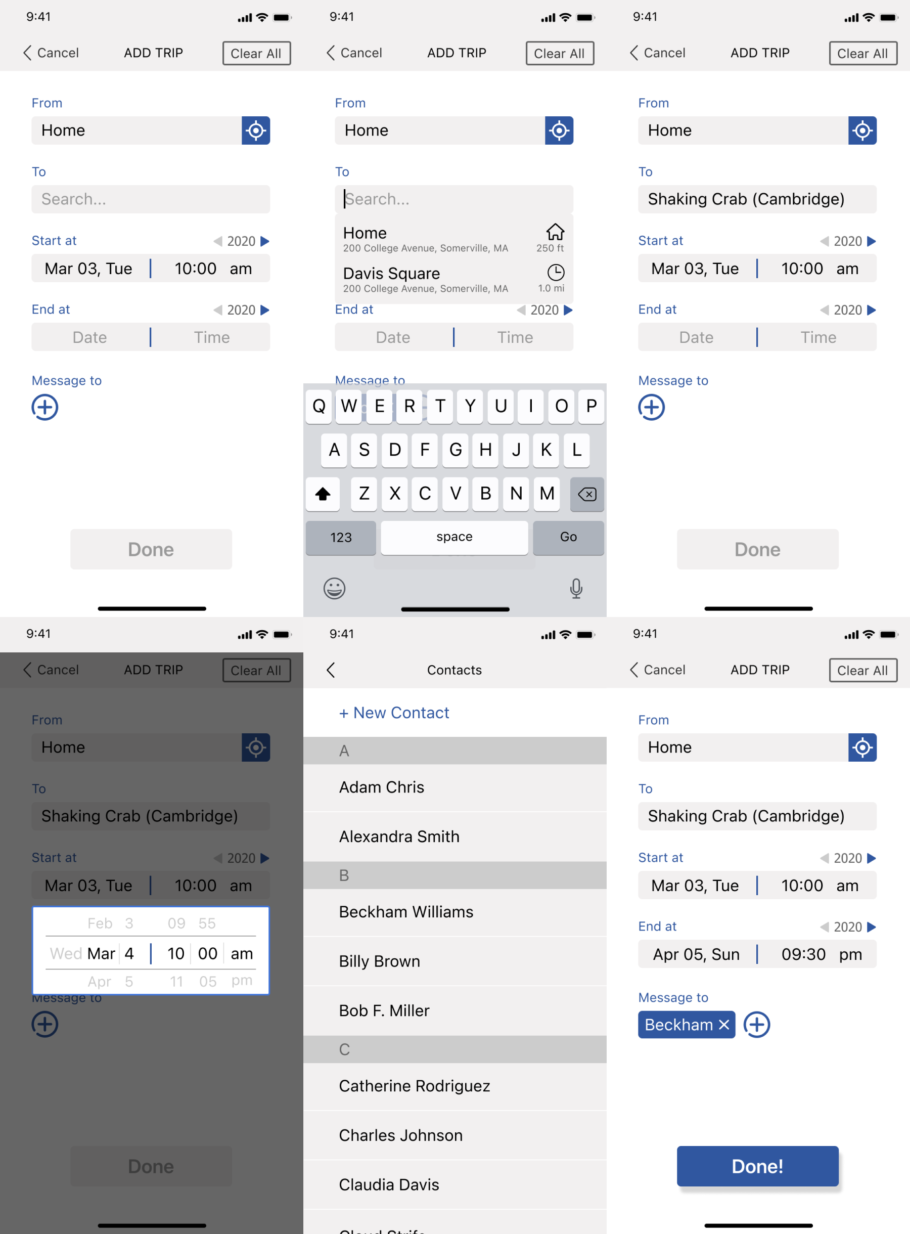
Based on the feedback, a new version of hi-fi prototype is created. I changed the color to ensure a better accessibility, and changed the design of some elements to highlight the content
After the optimization of the design, we conducted a second test for the new design. This time, we invited 2 participants (neither was in the test before) and asked them to do the same tasks as last time.
It turned out the new design really worked. Both of the participants gave a 5/5 for the experience, and telling that they love how simply and clear this App is. One of them even mentioned that it'd better not to add too much functions in the future versions.
Even keeping the App to be simple, it still have some rooms of improvement. Adding a GPS function will be helpful for the contacts to find the user who sent SOS. Gesture control will also be convenient for users to quickly send message if something happens.