Project Overview
The goal of this project is to design a music player application for Arcfox α's car system. The design needs to adapt to the special-sized screen and provide great media consumption experience to car owners and passengers.
My Role in the Project
I am one of the four designers in this project. During the project, I conducted part of research (research in automobile forums), and designed the user flows, wireframes and high-fidelity prototypes of searching and music player.
Feedback from Client (to v1.0)
"Clean and easy-to-understand Interface. The color in this design is consistent with Koowo mobile App. The concern and efforts about the safety during driving really hit the point. The time drivers distracted from driving should be less than 1 second. It will be even better if the information hierarchy can be more prominent."
Background of the Project

User Research - Who, What and Why?
In order to provide a solid design solution, we need to understand the scenarios and target users of this application. Moreover , since all the designers in our team have no experience in the field of car-screen interaction, we also need to do some market research to understand the industrial design requirements in this field.
After different methods of research, we came to the conclusion:
A music playing experience for new middle-class family to be able to co-operating on a stretched screen easily and safely.
Desktop Research - Users and Scenarios
We investigated 7 automotive forums and collected comments from all users who have purchased Arcfox α in an attempt to get the most honest feedback and feelings about the car. Here's why these users ended up buying this car model.
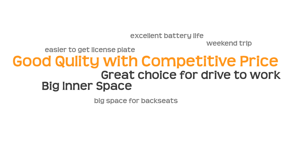
Therefore, we come to the conclusion: Our target users are mostly new middle-class family, and drive short to mid-distance trips with their own or family/friends.
Market Research - Car-screen Interface Design
- Big Screen - A lot of space for layout
- Gesture Control
- Voice Control
- Collaborative Operation
- Resizable Apps
Surveys - Behaviors of Music Player When Driving

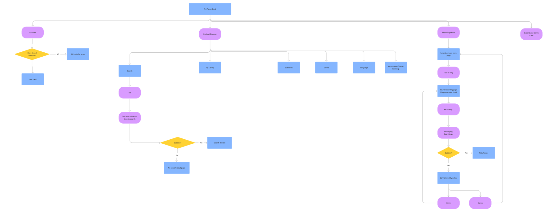
Start with the Flow
FullVersion
Level of Operating Difficulties

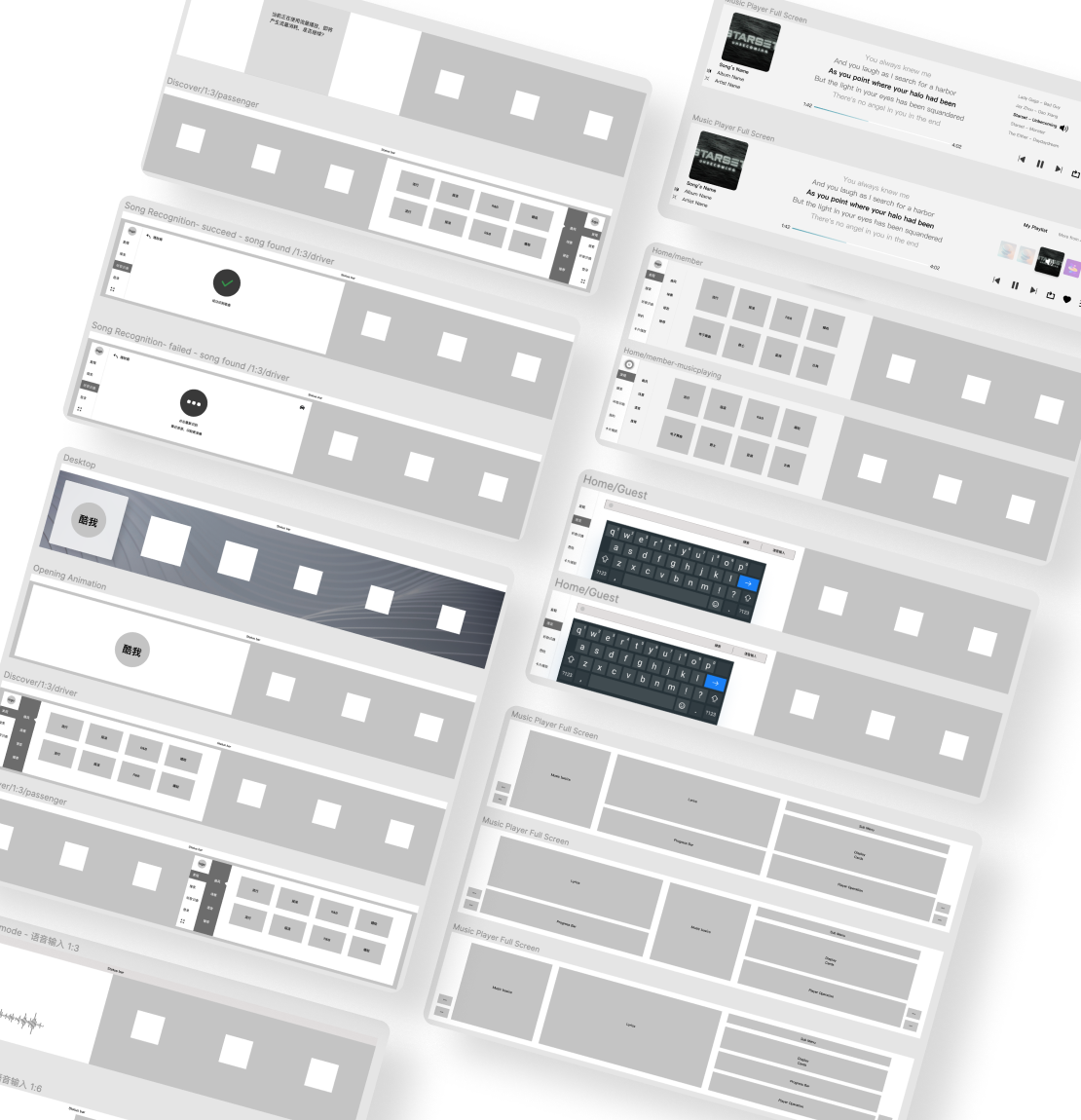
Explore and Wireframing
- 70+ wireframes
- 14 meetings
- 4 weeks
- 37+ hours
High Fidelity Prototype v1.0
After lots of explore, we finally created the first version of high fidelity prototypes.
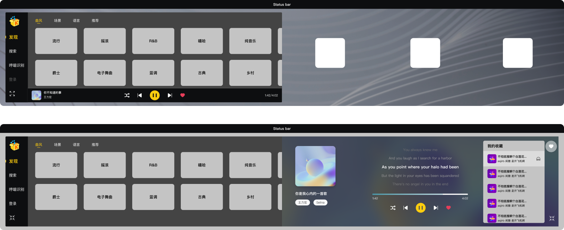
Explore
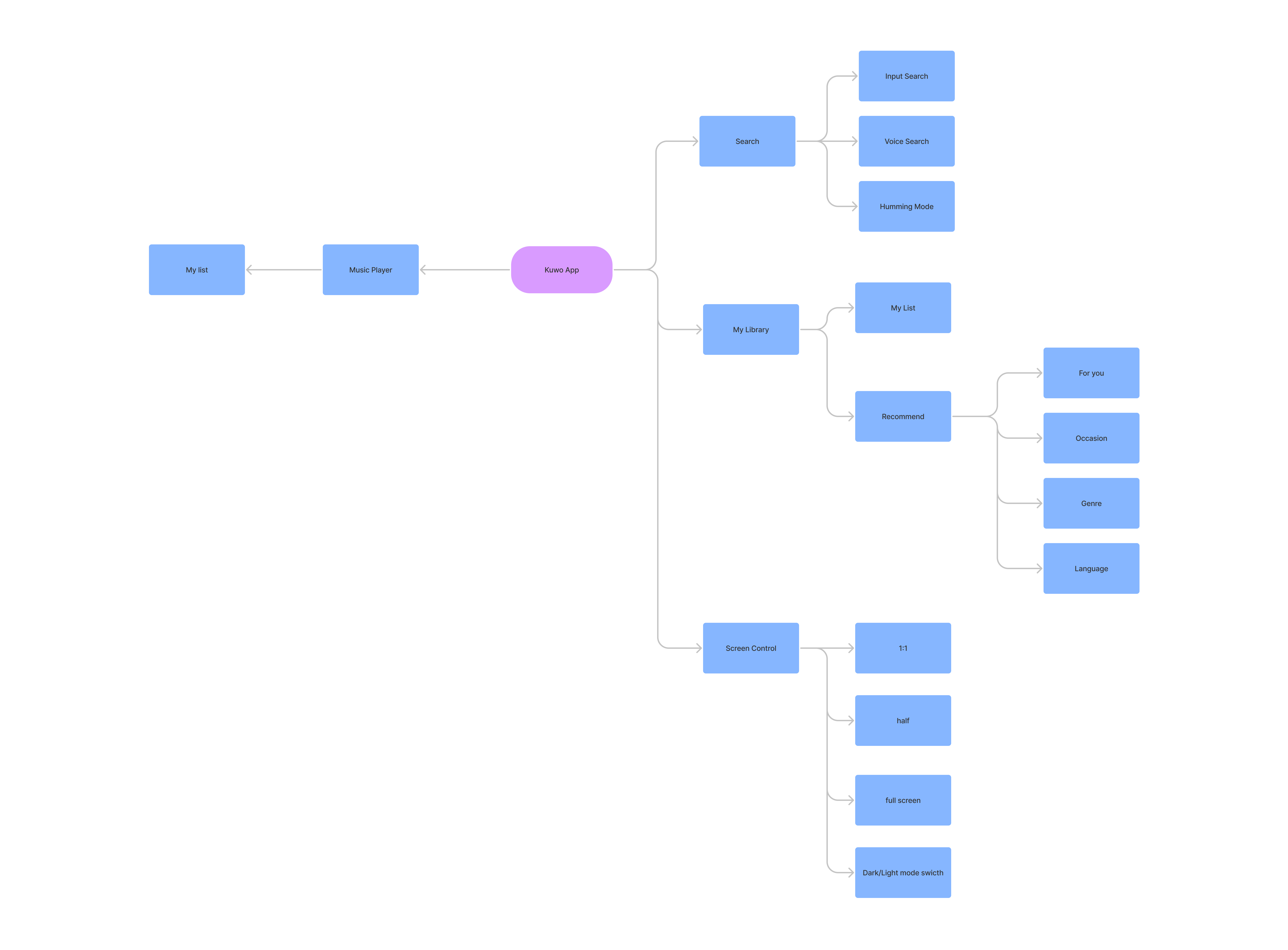
- The main menu is on the left for the driver to easily reach out and operate. The options on the menu is "Explore" (default), "Search", "Humming Mode" and "Login/Profile"
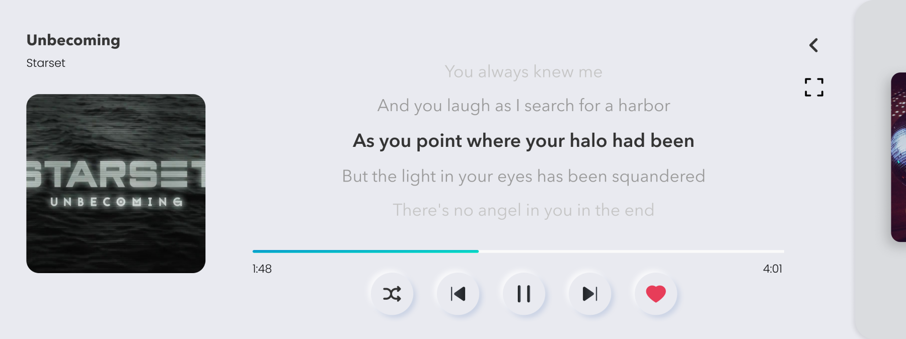
- A mini music player is always on the bottom of the card. One-click and it'll expand to a full-sized player
- The full-sized player can also be activated when users click and expand the whole App card to full-screen
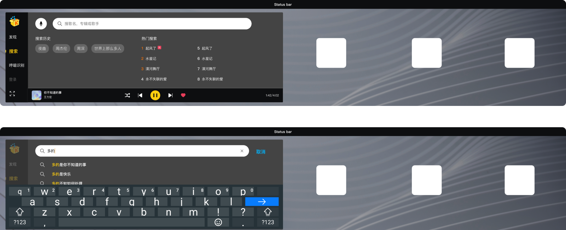
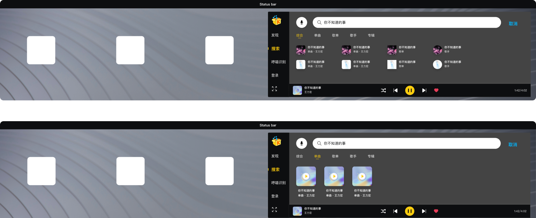
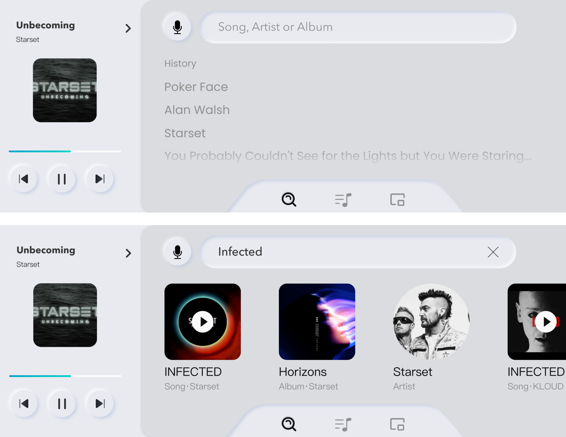
Search - Typing
- The search bar is on the top of search page, make sure users can find it by the first glance. The search history and recommended shows under the bar as default
- The voice searching button is on the left, easier for the driver to use
- Suggested search results will shows responsively in real-time to the content users are typing. The voice search button will be hided during the typing, help users to focus on the current task
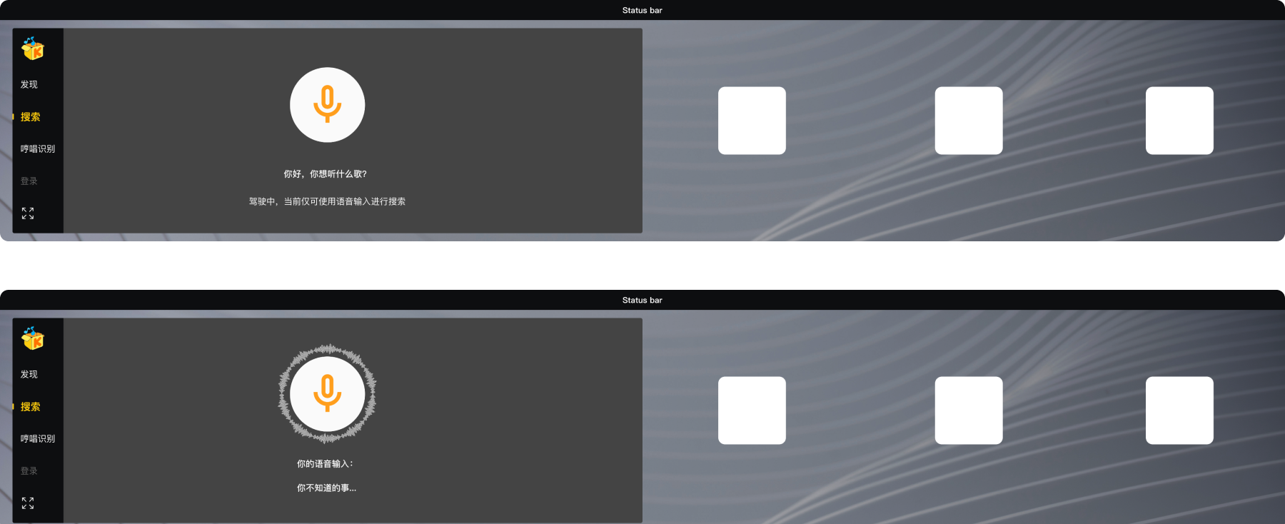
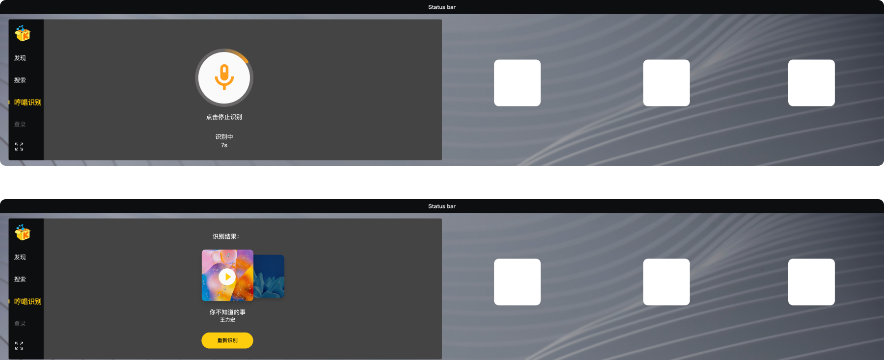
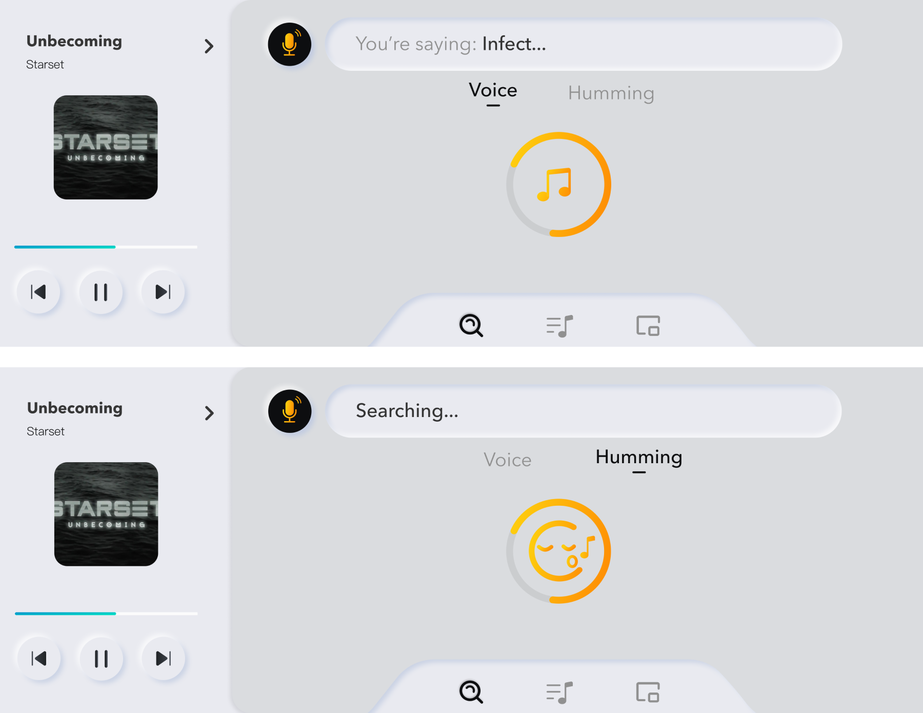
Search - Voice
- One-click the button and the page will switch to voice search and start recording
- If the car is in driving and it is the driver who's operating, there will be no typing search but only voice search. The text under the icon will also show this information
- The wave around the icon will be animated when receiving sounds. The text under it will shows the content it recognized
Search Result
- The whole App card can be dragged to the right for passengers to operate
- All types of result will be shown as default. Users can also click the tab as filters to narrow down the results
- Different shapes of the images in the result indicates their types (song, album/playlist or artist)
Humming Mode
- Humming mode is different from voice search. When users uses this feature, the App will record the melody users are singing and try to match it with existed songs
- The border of the icon and the text under it indicates it is during searching. Users can click the icon to stop searching
- A re-match button in the result page incase the result is not what users want
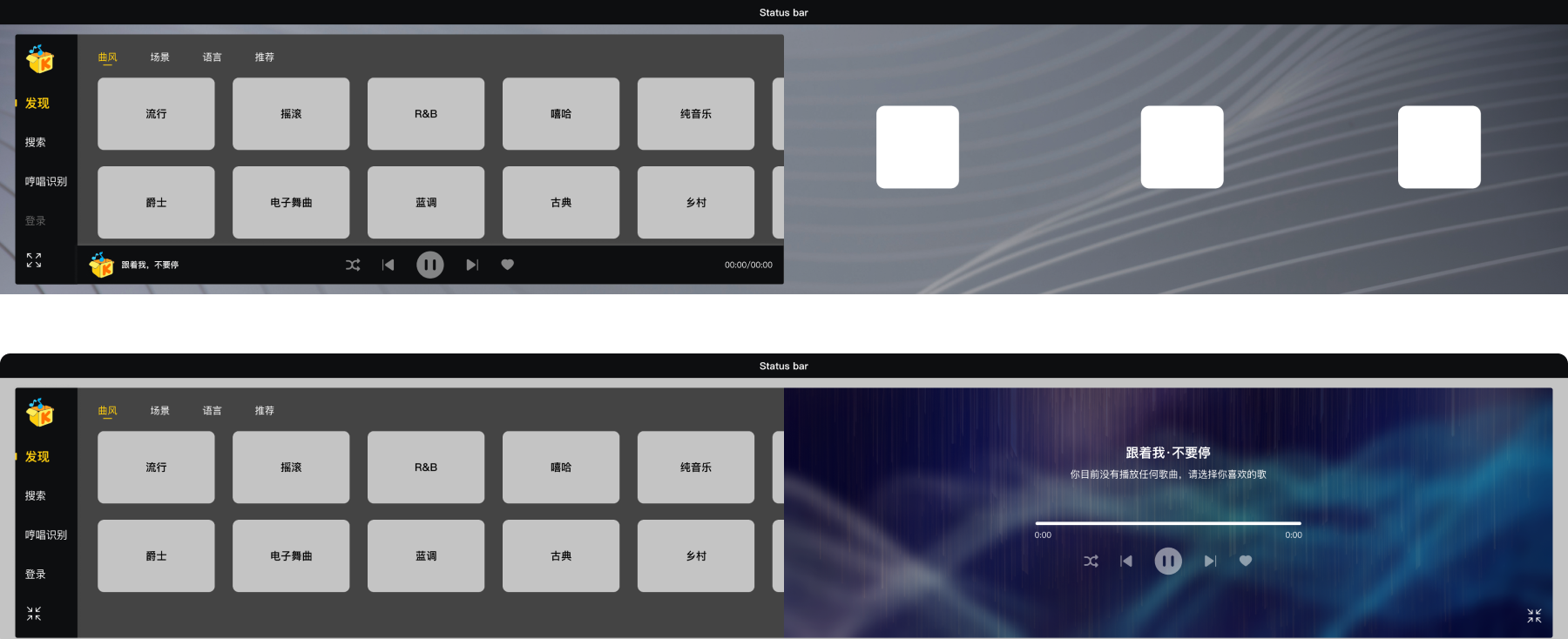
Blank State
- The music player will save and re-open the songs last time played. But if there's no such record - mostly for the new users - there will be a blank state for the player with Koowo slogan on it
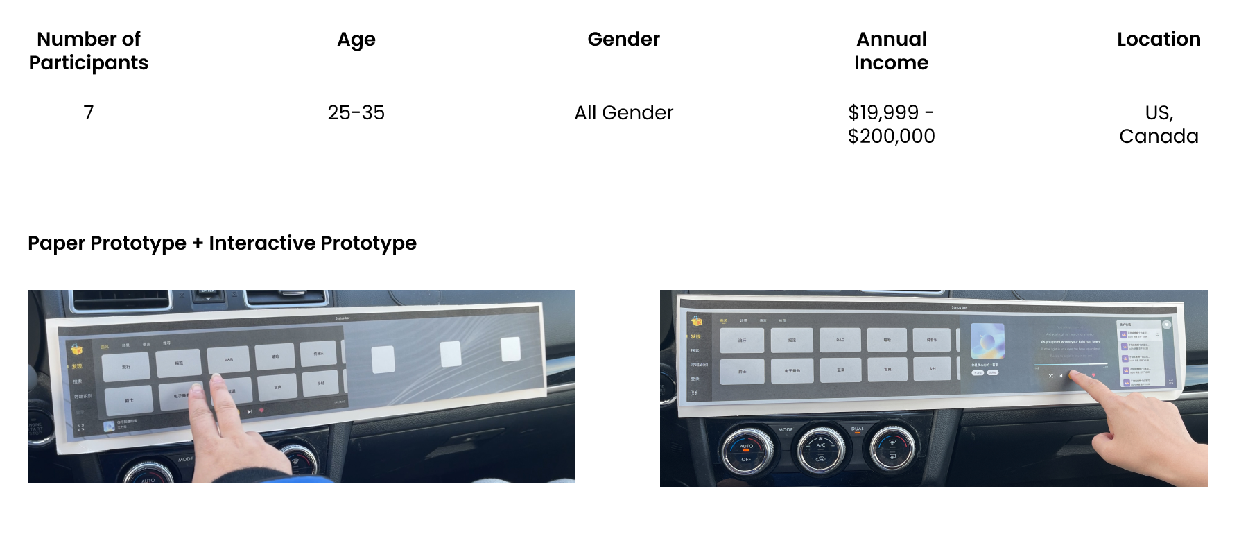
Usability Test
To figure out how our design works on real screen, we conducted the test by using both paper prototypes (1:1 scales) and interactive prototype (fit to iPad size).
The tasks includes choose a song while parking, search a song while driving, and ask the passenger in the front-seat to co-operate. Participants were asked to accomplish these tasks while driving in an empty street, with our team member in the front-seat.
Test Goals
Interaction
Visual Performance
Functionality
Test Information
Test Results
All participants were able to accomplished all the tasks without significant pause or confusion, which is better than we expect and shows our design can speak for itself. They can collaborate with passenger with no problem, and search safely by using only voice control while driving.
However, there are still rooms of improvement. According to the observation, some elements (like tag or play button) are too small for users to interact with. 3 participants also mentioned the order of the features in the menu is a little different from what they expected.
Optimize the Flow
FullVersion
High Fidelity Prototype v2.0
Based on the feedback from usability tests and our client, we created the second version of Hi-fi prototype.
According to our client's feedback, we changed our visual style from dark-UI to new morphism, so as to make the information more obvious but keep it clear as before. We also redid the flow of the App, and integrated some features in the menu (e.g. humming mode in "search" now).
Explore + My Playlist → Library
- The participants from the last test mentioned they listen to their own list most of the time, so we combined "explore" and "my playlist" and made it "library" in the menu. If users already signed in, "my playlist" will be the default page of "library"
- Our paper prototype shows passengers can reach to the middle of the App even it is on the left side, so we move the mini-player to the left (the driver needs it more) and the menu to the bottom
- The features of the whole App card, such as changing card size and/or color are now in the "card" on the menu, right to the "library"
Player
- We added an unfold button on the top-right of the mini-player so it's easier for users to figure out how to activate the player. By clicking the button, the player will expand to the right, push the menu part out of the screen
- By clicking the "full screen" button under the fold/unfold, users can also expand the card to full-screen and enjoy the music
Search - Typing
- More place for bigger buttons, boxes and texts
- Move the "recommend" to "library", so as to help users focus on searching
Search - Voice and Humming
- These two features are now all in "search". Users can choose the way they want by clicking tabs
- Icons on the menu and buttons will be slightly different while activated